bay-carousel-ng
Standalone Angular 21 carousel library published on npm.
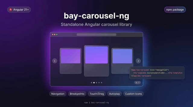
bay-carousel-ng is a standalone Angular 21 carousel library I built and published as an npm package for reusable, production-ready UI composition. It provides multiple navigation and pagination modes, responsive breakpoint behavior, touch/drag interactions, autoplay and loop controls, and customizable icon/template support for flexible design systems. The package is designed with a modern Angular architecture so teams can integrate it quickly into real projects with clean configuration and extensible behavior.
Context
Before AI coding tools, I kept running into the same wall: I couldn't find a carousel that did what I wanted. So in every project I wrote my own, and every time it came out a little different.
Problem
Existing carousels either looked the same everywhere or fought you as soon as you wanted a custom UI. Adding the layouts I needed was hard, and keeping them smooth was harder: a carousel with many slides renders a lot of DOM that nobody is looking at. Rewriting it per project also meant fixing the same bugs again and again.
Approach
I pulled what I kept rebuilding into one standalone Angular 21 library, built without any third-party slider or gesture package; its only dependency is tslib, the helper every Angular library ships with. Five modes (default, navigation, pagination, fraction, breakpoint) cover the common layouts, and slide and icon templates leave the look entirely to the host app. Touch and mouse drag, autoplay, loop, keyboard control, responsive breakpoints and synced main-and-thumbnail carousels are built in. For long lists, a performance mode renders only the visible slides plus a small buffer.
Outcome
Published on npm in March 2026 with documentation, an accessibility checklist, a breaking-change policy and a live demo. It has been downloaded around 600 times since, and it replaced the one-off carousels I used to write for each project.